Alternatives to Sherwin Williams Alabaster SW 7008
Countless home decor articles and “designer picks” lists rank Alabaster (SW 7008) as a classic go-to for white paint.
I can relate to this thought process, can you? — “I need a white, one that’s warm but not too yellow. Crisp but not stark. So I’ll consult my trusty pal Google images and, bam, Alabaster, a crowd favorite. It must work for me too, right?”
But alas, while there is nothing inherently wrong with Alabaster (or any color for that matter), you can’t simply take the advice of a magazine article or a photo you see on Pinterest and apply it to your own home.
So, is Alabaster right for you?
Where Alabaster works:
Alabaster has a touch of warmth, so it works especially well in rooms with north- or east-facing windows, since this light tends to feel cool.
Where Alabaster doesn’t work:
With bright white trim:
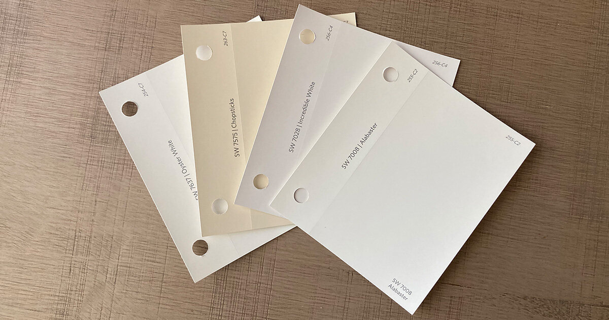
If you have super white or cool white trim, such as Incredible White (SW 7028), Alabaster will look dirty next to it. Mixing whites with too much contrast exaggerates their undertones, resulting in unintended color effects.
With grey or cool decor:
Similarly, Alabaster may skew yellow if it’s placed right next to cool cabinets or finishes. This is especially true with mid-tone grays, blues or minty-greens. This can be remedied by introducing contrast. For example, Alabaster often looks like a crisp white next to dark navy blue cabinets.
Lots of windows:
In rooms with a lot of light, you may opt for a heavier beige or griege. A darker white will read as “white” but feel warm and inviting without being too bright. Whites to consider: Chopsticks (SW 7575) or Oyster White (SW 7637).
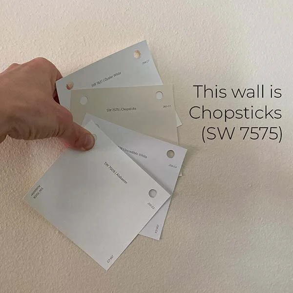
Don’t be afraid of dark, warm whites — they will look lighter on the wall. Even though the Chopsticks paper swatch in the photo above looks dark and dirty with the other samples, it looks fresh as a paint color when applied!
Bottom line:
Before selecting Alabaster or any of the colors mentioned above, do a thorough assessment of lighting and colors in your home to make sure Alabaster will harmonize with existing conditions.